

Countable | UX Teardown + iOS Design
A version of this post can also be seen on Medium.
Overview
When's the last time you knew what your Representatives were up to?
For me, the answer is almost never. I am oversaturated with articles and opinions on social media, but rarely do I see a way to take action on the issues that matter to me. When a friend told me about the Countable app that lets you tell your Reps what you think about bills going through congress, I knew I had to check it out for myself.
I noticed there was a ton of great copy in the app, but the user experience in the app confused me. So, I did some guerrilla usability testing to see how I could improve the app.
The Challenge
The two biggest pain points for users were that there was no easy way to search for issues, and no clear way to contact your representative. Both pain points are core functions of Countable.
My Role: Product Designer
My process included guerrilla usability testing, ideation, hifi redesign, and validation testing. This is a personal project and I was not affiliated with Countable at the time of this project.
TL;DR
I redesigned Countable's search function, added a progress bar to bills moving through Congress, and created a notification flow for when users vote on the issues they care about in the app.
Design Process
Persona Creation
I created a provisional persona to help me think through Countable's current users' behaviors, needs, and motivations for using Countable. I make some quick assumptions as a starting point and set out to validate or invalidate them through usability testing.

Guerrilla Usability Testing
I conducted seven guerrilla usability tests on people who had never used Countable before. After asking some background questions on their interest levels in news and politics, I asked users to perform four tasks centered around finding political issues they cared about and contacting their representatives.

“I want there to be a way to mobilize action within the app."

“You would expect the search bar to be at the top.”
“I want there to be a way to mobilize action within the app.”
Synthesis & Analysis
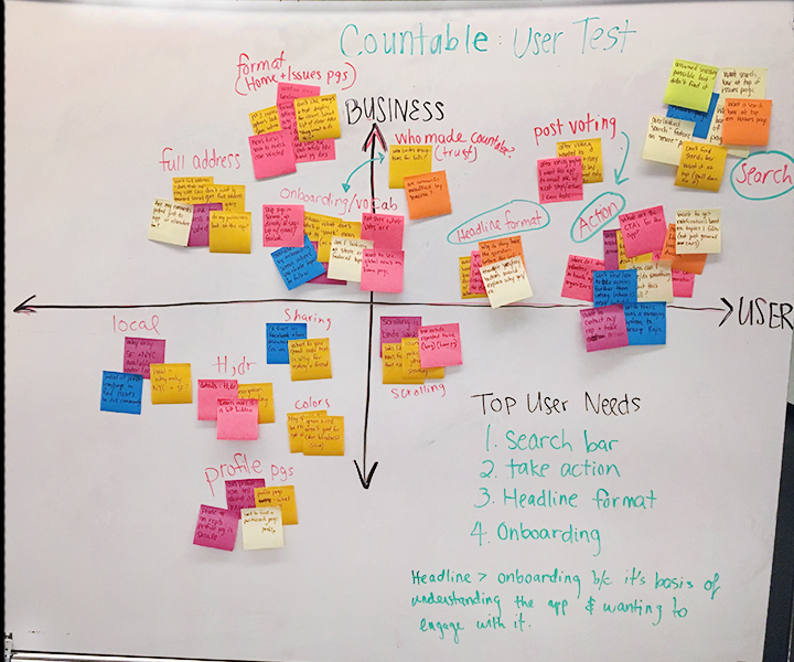
To synthesize my findings, I reviewed each interview recording and wrote down pain points users experienced on post-it notes. I used a different color post-it for each user.

I grouped similar pain points together and labeled them. Common themes emerged around users trusting the app, seeing too much text, not being able to find issues or representatives, not being able to contact representatives, the headline format, a scrolling bug, and how to share issues users cared about.

Once I'd grouped the pain points, I plotted them on a 2 x 2 graph with business interests on the Y axis, and user needs on the X axis. Pain points placed on top of the Y axis are most important to Countable (business) and those place on the right of X axis are most important to users.
Calling Out My Assumptions
To plot the pain points, I had to first make some assumptions about what was important to Countable. My main assumptions were that:
Countable’s Unique Value Proposition (UVP) is simplifying the congressional process to make it easier for people to take action on the issues they care about.
Anything that makes Countable’s UVP difficult to understand is of high importance to fix.
If given a list of problems to fix, the one that is easiest to fix and yields the highest impact (around users understanding Countable’s UVP) would be solved first.
The pain points in the top right quadrant (most important to Countable and its users) were:
Taking action within the app
Not being about to search for issues
The headline format
I decided to tackle the search function and the take action issues because they were most important to users and critical to Countable's success as an app.
Task Flows and UI Sketches
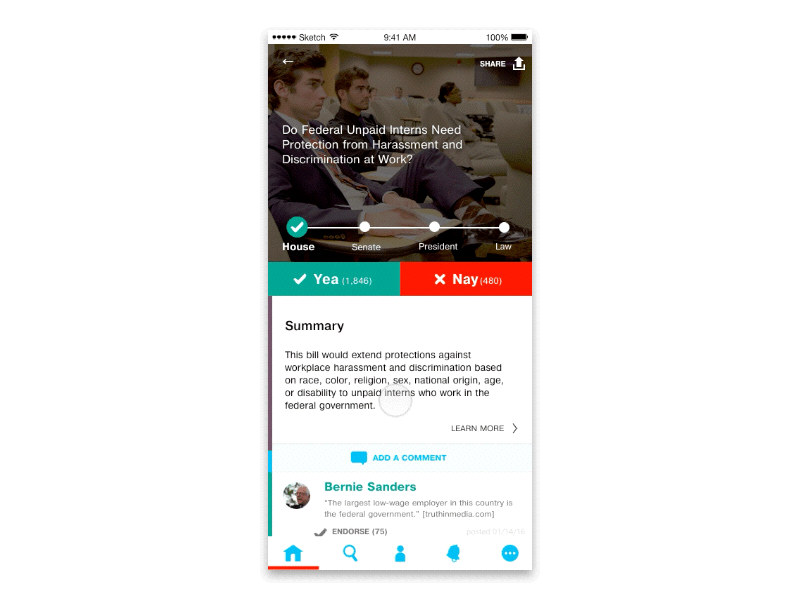
To understand the "take action" pain point, I wrote out a task flow to see how a user can currently contact their Representative about a specific issue in the app.
Note: In the current app, this is difficult. There is no notification after you vote or comment on an issue that your opinion is being sent to your Rep. I only realized my opinion had been sent to my Rep after receiving an email response from her about a week after I'd voted in the app.
I knew users needed to be notified of their action way before getting the email I'd received. After looking at the current task flow in the app when voting on a bill, I saw where the opportunity to notify users would fit best.


After adding to the current task flow, I sketched out what the new flow could look like.

Sketching a flow from voting, to emailing your Rep, to submitting.
Hi-Fi Mockups
From paper UI sketches, I moved into Sketch to create some hi-fi mockups of a redesign of the notification flow and search function.
Before & After


Hi-fi Validation
I tested my search solution on 7 iOS users, three of whom had seen the app before, but weren’t super familiar with it.
When given the scenario, “Imagine you really care about animals and want to learn more about what’s going on in congress that affects animals. How would you find that out?”, 7/7 users successfully completed the task by clicking on the search icon and clicking on Animals.
Two users did, however, ask for a confirmation notification after they'd sent the email to their representatives, so I added that to the notification flow for version two below.
Conclusions
By creating a more prominent search function, a progress bar for each bill, and a clear notification flow once you've voted on a bill, this redesign helps users to understand Countable's Unique Value Proposition. This redesign is only one solution, and continued testing and iteration would be needed to verify its success.
From users' reactions to the app during testing, I see great potential for Countable to give its users agency over a confusing political system. Now there's no excuse not to take action on the issues that matter most to us. :)
Check out a version of this case study on Medium.