
Chime | UX Research + Android Design
A full clickable prototype can be found at the bottom of this page.
Overview
Chime is a mobile-first bank for millennials that’s aiming to bring trust, transparency, and positivity into the banking industry. Their eventual goal is to help their members build wealth by empowering them to develop healthy spending and saving habits.
The Problem
What features do tech millennials want in a mobile banking experience? Our challenge was to design a more positive, trustworthy, and helpful banking experience to move Chime closer to their long-term product goals. In terms of project scope, this meant validating Chime's beta iOS home screen design through user research and redesigning the beta Android home screen.
The Solution
A research-based predictive persona for the user group Chime wanted to break into
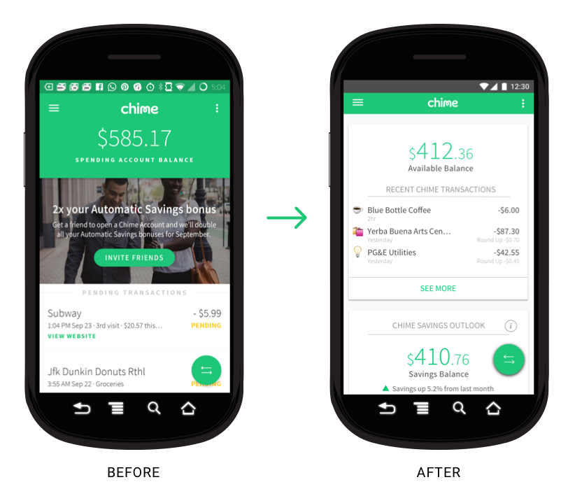
Android home screen designed for clarity to build trust and positivity to entice new members to stick around.

Our hi-fi redesign of Chime's Android home screen
My Role: Lead Product Designer
I led a team of seven awesome designers over four weeks to deliver research findings and a final redesign of the Android home screen. My main responsibilities included being the decision maker to move our design process forward, communicating with the client, and project management.
The Process

Phase 1: Research
We kicked off our research phase by reviewing Chime's market research and doing a competitive analysis to better understand the finance tech landscape.

Source: Chime Market Report
Key insight: Low Net Promoter Score for banks ≠ high motivation to switch banks
Chime’s market research indicated that no one loved their banks, and while this sentiment was expressed in user interviews as well, users were not looking to change banks. We realized that people accept what a bank is (a place that holds your money and can charge you fees if you’re not careful) rather than thinking about what a bank could be.
Provisional Personas
To help us think about the behaviors and needs of users, we created provisional personas for Chime’s current user and new target user.
Meet Kayla - she represents Chime’s current user base (lower income, single mom, millennial)

Meet Chris - he represents Chime’s new target user (higher income, recent college grad, tech millennial).

Key insight: We realized that usability testing alone would not help us fully understand the needs and desires of Chime’s new target user.
So we also did some generative research to gain a deeper understanding of the emotional landscape behind personal finances for millennials in tech.
We split our research into two parts:
Part I: Usability Testing
Objectives:
Validate Chime beta by testing comprehension of home screen prototype
Part II: Problem Interviews
Objectives:
To test the target persona and get closer to a predictive persona
Validate that the concepts behind Chime beta are things target users want
Understand target user's emotional framework behind financial decision-making
Calling Out Our Assumptions
Based on the market research, our provisional personas, and conversations with Chime, we wrote down some assumptions to validate during testing.
We believed that:
People are unhappy with their banks.
People want help controlling their money.
Increasing communication between a user and their bank will be helpful.
People want to see all their finances in one place.
Better access to financial information leads to behavior change.
Part I: Usability Testing on Chime's iOS Beta Design
We conducted five usability tests with millennials who had never used Chime before to test the comprehension of the home screen. We found that users liked the visual design, but found many pain points concerning the UX.

We synthesized our findings by writing down positive experiences and pain points on post-it notes for each user, grouping them based on similarities, and then plotting them on a 2x2 graph to map out the pain points that would be of highest impact to users and to Chime to focus on in the redesign.


Key Takeaway: We decided to focus on increasing the feeling of trust and security and clarifying terminology for the UX redesign phase.
Part II: Problem Interviews
We conducted five 30-minute interviews to better understand Chime's preferred users' behaviors and emotions around personal finance. We wanted to find out: Is Chime currently solving a problem that exists for these users?
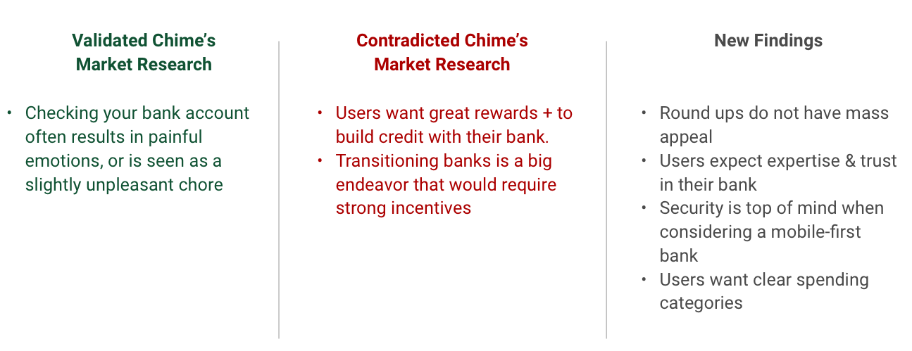
Our findings showed where our research was in line with Chime's, where it differed, and where we could add new insights.
Predictive Personas
A predictive persona is one who is more likely to actually become a user. From the synthesis, we created two predictive personas: one that represents users who would be more interested in Chime beta, and one that represents users who would be more interested in Chime in the future (helping its members to build wealth). We used the first predictive persona to guide our redesign and gave the second one to the client to guide further rounds of research.
Meet Georgia, who represents users likely to want to download Chime beta:

Next steps
How might we design a positive banking experience to alleviate Georgia's negative emotions around banking?
How might we give Georgia a feeling of control over her financial life and help her develop healthy financial habits?
Phase 2: UX Redesign
UX Design Key Insights
We linked users' love of rewards to build a more positive interface within the constraints of Chime's business model. We did this with a confetti pop-up modal to call out healthy savings habits, and adding a smiley face emoji to the savings outlook section (may sound silly, but it worked!) 😊
Our goal was to maximize rewards received for each transaction to incentivize users to use their Chime card more frequently.
Pop Up Modal

The majority of users we tested in lo-fi and hi-fi felt the pop-up modal was positive and habit-rewarding.

“I like that there’s an upward trend and also a smiley face. Even if I don’t understand what’s going on here, those indicators suggest that I’m doing well financially.” - Josh
Users didn’t understand the terms Chime used in their interface which decreased trust/security of Chime. To design for trust, we used familiar terminology, e.g. changing 'Spending Balance' to 'Available Balance', and clarified terms and sections that weren’t clear, e.g. using a 'more info' modal for the Savings Outlook and Connected Accounts sections.


